SAUERKIDS: LOONEY TOONS ON MEDICATION
Mark Moget and Taco Sipma form the artist duo Sauerkids, based in Rotterdam. With day jobs as graphic designers at Dutch design agency Enchilada, the Sauerkids label is the perfect outlet for their personal, non-client based work. Although they have been accused of “being on medication”, their work is probably better described as a mash-up of innocent childhood imagery and the mental confusion of everyday life. We talked to them about their recent move into more abstract forms of action painting.
Pictoplasma: You work together both as graphic designers and as artists. Can you explain how these two fields are related and how you manage to keep them separate? This is especially relevant because much of your artwork builds on visual communication, incorporating icons, mascots or infographics. Do you think of your art as commenting on your commercial work.
Sauerkids: Keeping our graphic design practice separate from Sauerkids has never been an issue, as both practices stem from different needs. As graphic designers we obviously work—to a certain extent—with a commercial perspective: we use our visual linguistic skills to solve communication problems for different clients. At Sauerkids, which is mostly non-commercial, we use the same visual linguistic skills to lead people astray. We have never thought of it as a commentary on our commercial practice, but I think you are right in that we use the same visual linguistic principles. One could say that Sauerkids’ work is a sort of twisted communication art form from another universe, which is unable to get its message across. We try to build a parallel universe that has recognizable elements, but they’re never used in the way they’re supposed to be. We try to tame, and at the same time amplify, the confusion of everyday life.
Art is traditionally thought of as critical and non-commercial. While one can question if it ever really was, do you think this type of critique is still relevant today?
For some artists this critical approach is valuable, but for us it has no meaning whatsoever. It’s a good thing that there are artists—filmmakers, writers, painters, sculptors, etc. —who reflect on or criticise the times we live in. I think they serve a very important purpose, especially in countries where freedom is a rare commodity; think of Ai Weiwei, for instance. But generally, for us, art is more of a personal thing, something that can give us new perspectives. We tend to stay away from art that is too one-dimensional in its vision. In the worst case, it becomes commercial art or propaganda.
Many of your paintings make clear references to cartoon characters, while others feature more generic archetypical figures. Do you consider your work to be a remix of found footage? What drives your choice of material? When we talk about remix, we think of digital culture, of cut and paste. Where do your paintings stand in the context of digital culture?
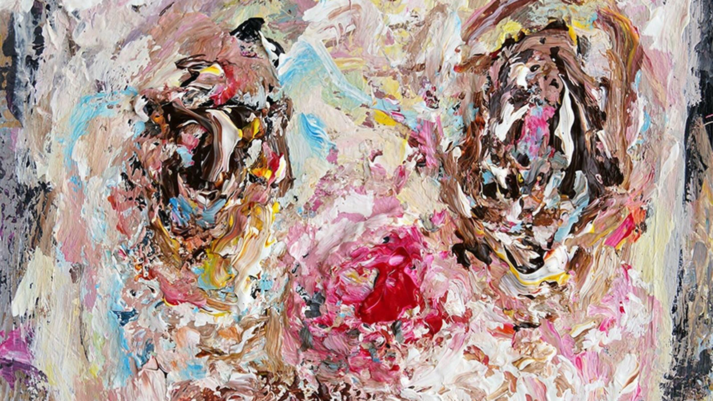
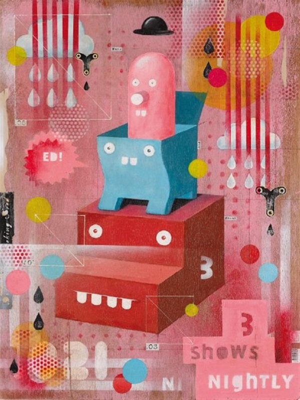
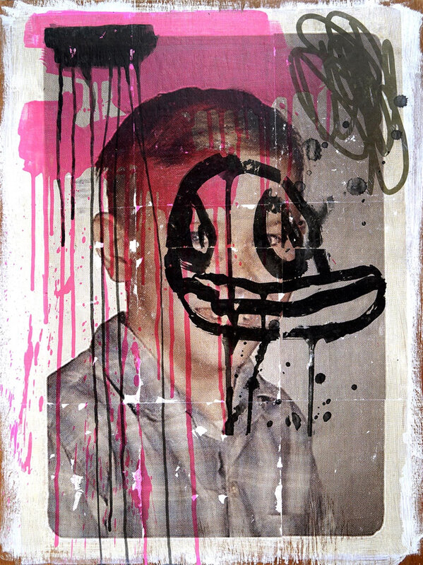
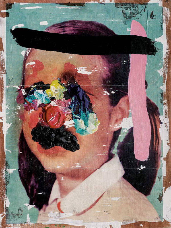
Most of our characters are based on classical cartoon characters or, more specifically, on how we think they would look in our universe. They aren’t sampled directly, but drawn from memory while we’re thinking of Walt Disney or Tex Avery. Placing them in non-cartoon surroundings or constructed worlds with no clear goal makes them look lost. We have good drawing skills but no fixed style. We approach all of our work as designers solving a problem, not as illustrators with a signature character. We do have different ways of working, though. In the more constructed paintings we paint the background first, then photograph it, put it onto the computer, draw on it in Illustrator and then print out the result and use it as a sketch for the painting. In the process, the sketch often gets forgotten among all the spontaneous things that lead to the end result. Then there are the more recent paintings, without typographic elements, that could be considered portraits. Many of these sample photographs. We have been collecting all kinds of strange imagery and printed material for years, and we’ve finally found a way to use it. We might search the Internet or use our huge collection of family slides found at flea markets, which are a constant source of inspiration. For some works we even overlay a number of sources. We use all these photos as a background and paint new faces on top. The crude painting is a way to avoid making technique more important than the painting itself. We are pretty skilled as painters, but for now we choose to paint as if we were doing it for the first time. This is also true of the portraits that don’t use a sampled photographic background. The only difference is that there is no sketch or reference; we just start painting. It’s a form of action painting.
Another signature of your work is to draw characters that look like deformed, empathetic mascots. Do you think that characters have dignity, or even an identity of their own, and that pushing them into different contexts—whether advertising or art—shows a lack of respect? Do you feel pity for them?
It’s a double standard: we deliberately make them look silly and put them into weird situations where there’s no escape, but we also pity them. Most of our characters not only look stupid, they are stupid; they can’t help themselves, but they don’t mean any harm. At the same time, we think of them with sympathy, almost in the same way you can’t hate your pet for ruining your carpet. And, yes, we do think they have their own identity.

You have very specific titles for your paintings. Where do they come from and how do they relate to the works?
We feel very strongly that the title is just as important as the size, the frame, or even the work itself. Sometimes a title can be the starting point for a painting. A finished painting without a title is an unfinished painting. We also experiment with different languages because of the different feel that they have. English immediately feels pop or rock ’n’ roll, French sounds poetic and classical, and a German title instantly feels profound and meaningful. I once came across the Spanish sentence “Me aburro como un hongo”. To a non-Spanish speaker this sounds poetic, but in fact it just means “I’m bored as hell”. A bad title can totally ruin a work. As a result of our (typo)graphic design and communication background, we constantly have to deal with text—I think that’s where our love of text originates. We also love the interaction between text and image; text can cause confusion but can also decipher a work or give it a context. We always try to avoid narrative titles that explain a work. Another reason why we love good titles is that they give us an opportunity to incorporate typography in the work. All the typefaces that we use in our work are designed by us.
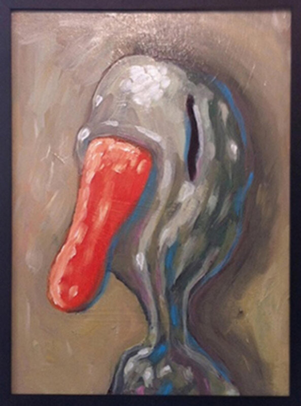
Animals, especially ducks, are a recurring motif. You humanise them, giving them names.
Naming our characters is indeed very important to us. The moment you name them, they become instantly humanised, especially if you give them ordinary names, like Eddy or Frank, or upper class names like Wilbur or Rupert. The whole duck thing is a reference to Donald Duck and other Disney characters, not that either of us are particularly fond of the jealous, deceitful and obnoxious Donald Duck. We generally create characters that we like. Those are the characters that we invite into our parallel universe.
Originally published in the “White Noise” catalogue accompanying the Pictoplasma exhibition at La Casa Encendida, Madrid, 2013
- 192 views
- 0x empathizes