GENEVIÈVE GAUCKLER: RECOGNITION VALUE WITH A SOUL
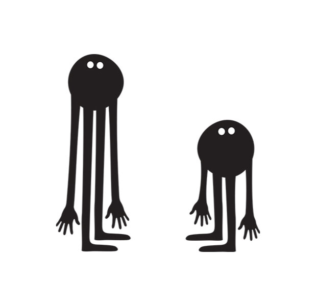
Geneviève is a French illustrator renowned for an ever-evolving procession of loveable characters and technicolor digital mashes. Her works are bright, fun and hectic, often combining symmetrical designs with soft-edged computer-generated images against photographic backgrounds. Her initial black, egg-shaped character with white dots for eyes has gradually mutated into other forms and colours.
Pictoplasma: How did you get into designing characters? Was there a particular catalyst for the move from layout and graphic design to designing characters?
Geneviève Gauckler: It took me a few years to make the move to illustration. It happened while I was in London working at the Internet company boo.com and, afterwards, at Me Company. I was working on various logos and symbols, so I was using vectors more often. I was also working on simple Flash animations. Then I realised how easy it was to come up with a character without having to draw it, simply by using existing shapes and copying and cutting them.

I loved this process, which is like a collage. Since Illustrator is quite a rigid tool, I prefer to make really simple things, because it takes less time! Using rounded shapes for the head, two white dots for the eyes, some lines for the legs and… Well, that’s it.
Your iconic characters are black, egg-shaped, single-celled organisms with two white dots for eyes. Your first project was the book L’arbre génialogique [The Family Tree, 2003], in which these characters constantly morph into other forms. Where did the idea come from?
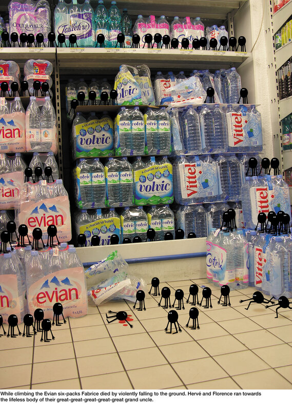
I started working on this comic book because I didn’t have anything else to work on. I thought it would be a good idea to use my free time to create something new and entertaining, so I wrote and drew a few pages, but I wasn’t happy with them. It looked like a real comic book, with backgrounds, but it was too time-consuming and the creative process was boring, so I started putting just one character on each page and multiplying it, changing a few details, but keeping it simple. Then I came up with the idea of two characters that meet and have babies. They all have the same eyes, the same look, because they all belong to the same family. They didn’t need to express any feelings, so there was no need to draw mouths to show them as happy or sad. The captions explain everything in the book.

When did you start introducing other colours?
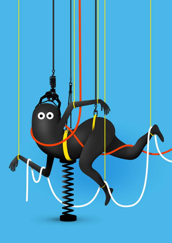
I needed a change. I was curious to see how all these characters would look in colour. I’m very careful with colour. I try to use it in a simple way—it shouldn’t make the characters more complicated, but it makes sense to use colours and shadows to make them look more real.
Your characters are instantly recognisable and, in particular, the black and white ones often feel and read like typography. They resemble logos or brand mascots, even though they are not attached to any particular product. Are they influenced by logo, brand or mascot design?
Is that something you think about when you work on a new design?
Absolutely not. But I used to be a graphic designer and I love typography. I love working with vectors—I can spend hours with Bézier curves! I’m always tempted to simplify shapes, to “clean” them and remove anything unnecessary. I’m also fascinated by the classic logotypes, like Coca-Cola, and by mascots, by their beauty and simplicity, by their universality, and by the fact that they are instantly recognisable. When I’m working I only try to imbue my characters with what I’m feeling at that moment, though.

In their book Mille plateaux (A Thousand Plateaus, 1980), the French post-structuralists Deleuze & Guattari wrote about the face as a semiotic machine and introduced the formula “white wall-black hole” as its matrix. Looking at your characters, they seem to reflect that thought in a simple image. Have you discovered a standard formula for creating faces?
All I know is that I always try to be honest when I’m working. It’s very simple: my work reflects my feelings. I guess all my characters are a reflection of myself. These two white dots on a black face seem to express an emotion that I often have: feeling like a spectator, like an alien who sees things for the first time, without judging them, just looking at things and thinking, “What a strange world this is. What am I doing here?”

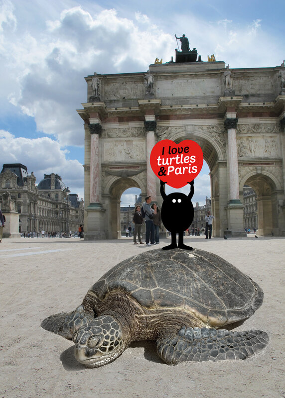
You seem to wander effortlessly between personal and commercial work, using your characters for both conceptual exhibitions and advertising campaigns. Unlike a more traditional artist, who would claim independence and freedom from commercial contexts, your work and characters seem untouched by the various fields in which they are used—or they even become stronger because of those commercial contexts.
I’m glad you think so! Characters can sell their souls to the commercial world without getting dirty. I think it’s because I’m happy to work in both areas: personal and commercial. It doesn’t really matter for me, as long as the client respects and understands my work. It’s important to be selective when choosing a client—that’s why you need a good agent. When I’m working on a commercial job my state of mind is the same as when I’m working on a personal job. I just try to do my best. Maybe that’s why my little babies always look great.

Originally published in the “White Noise” catalogue accompanying the Pictoplasma exhibition at La Casa Encendida, Madrid, 2013
- 225 views
- 0x empathizes